An introduction to the Layout Grid - Part 1
The layout grid provides the quick and easy way to create multi column responsive (floating) layouts of the web pages. A grid can have up to 12 columns, with sizes in percentages. Objects that are dragged onto a grid will automatically become floating, which means that they are placed next to each other (from left to right) depending on the available space. If the object does not fit on the current row then it will be wrapped to the next row. Some objects (like images, text, blog, photo gallery) can be full width, so they always take up the entire row and stretch or shrink when the page size changes. For smaller (mobile) screens all columns are stacked based on the defined breakpoint. This is a great new way to create flexible and responsive (Bootstrap-like) layouts!
See also the Layout Grid FAQ: http://quickandeasywebbuilder.com/forum/viewtopic.php?f=10&t=43910
Important: Do not use 'Center in browser window' in combination with layout grids. This option should only be used for 'fixed' content.
Note: You cannot change the size or position of the layout grid. The grid's size depends on its contents. The grid's position is 'floating' and it will be automatically positioned after the previous floating object.
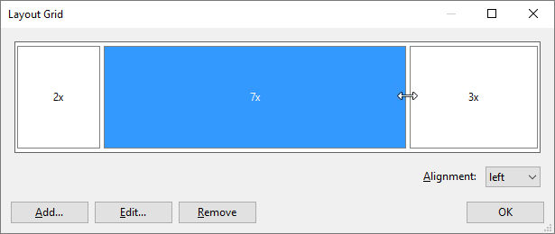
Managing columns
Click 'Columns' inthe properties to manage the colums of the layout grid. To insert an extra column, click the 'Add' button. The width of the columns can be adjusted by dragging the handles between the columns. To remove a column, first select it and then click 'Remove'. It's also possible to remove a column by dragging the right handle of a column to the right.
Each column can have its own alignment. To change the alignment, click the column and then select the alignment.
Desktop
Mobile


Adding objects
To add objects to the layout grid, simply drag & drop the object inside a column. The column will highlight to indicate where the object will be added. Note that the mouse cursor needs to be inside the column.
To add objects to the layout grid, simply drag & drop the object inside a column. The column will highlight to indicate where the object will be added. Note that the mouse cursor needs to be inside the column.
Objects that are part of the layout grid will no longer have a fixed position. They will be 'floating' inside the column.
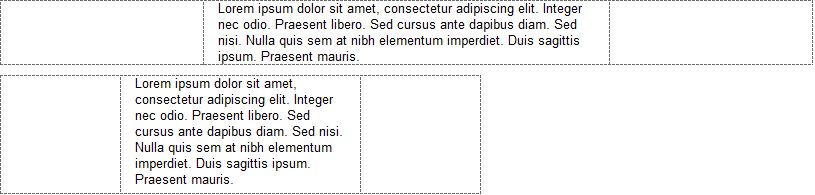
Adding text
When text is added to the layout grid, it will automatically use the full width of the column. So if you resize the width of the page, the text will dynamically adjust.
Adding text
When text is added to the layout grid, it will automatically use the full width of the column. So if you resize the width of the page, the text will dynamically adjust.
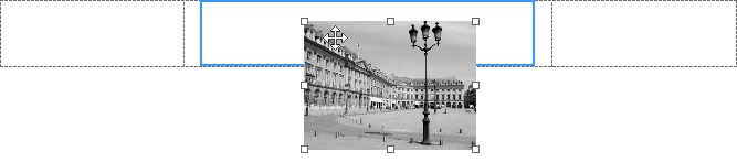
Adding images
Images that are part of a grid can either be responsive (adjust to the size of the column) or have fixed size. This can be configured with the
"Full width' option in the Image properties. Note that this option is only available if the image is part of a Layout Grid!
Maximum width specifies the maximum size of the image when it is set to full width. This prevents the image from getting too large in responsive layouts.
Note: the Full Width option is also available for the Rollover Image and SlideShow.
Adding video (YouTube/Vimeo/HTML5)
Just like images, videos can also be responsive or have fixed size. However unlike images, the browser cannot automatically determine the aspect ratio of the video. By specifying the aspect ratio in Web Builder, the video will be responsive while maintaining a certain aspect ratio!
Just like images, videos can also be responsive or have fixed size. However unlike images, the browser cannot automatically determine the aspect ratio of the video. By specifying the aspect ratio in Web Builder, the video will be responsive while maintaining a certain aspect ratio!
Adding other objects
Different objects have different behavior in the layout grid. Some objects are flexible, so they use the full width of a column while others have a fixed size (not affected by the column width).
Examples of 'flexible' objects:
• Text
• Photo Gallery
• Horizontal Line
• Inline Frame
• Blog
• Form input fields (editbox, combobox, text aera)
• Login forms
• News Feed Ticker
Examples of 'fixed' objects:
• Shapes and other drawing tools
• Buttons
• Navigation objects
Some objects cannot be part of a layout grid because they cannot be stretched automatically. For example:
• Layers
• Forms
• Tabs
• Accordion
This behaviour may change in future updates.
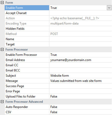
Forms
Although you cannot drag a form to a layout grid, the grid itself can be a form! To make it easier to create a form in a Layout Grid, you can configure the grid itself as a form. So it will be just a matter of dragging form elements to the grid.
Different objects have different behavior in the layout grid. Some objects are flexible, so they use the full width of a column while others have a fixed size (not affected by the column width).
Examples of 'flexible' objects:
• Text
• Photo Gallery
• Horizontal Line
• Inline Frame
• Blog
• Form input fields (editbox, combobox, text aera)
• Login forms
• News Feed Ticker
Examples of 'fixed' objects:
• Shapes and other drawing tools
• Buttons
• Navigation objects
Some objects cannot be part of a layout grid because they cannot be stretched automatically. For example:
• Layers
• Forms
• Tabs
• Accordion
This behaviour may change in future updates.
Forms
Although you cannot drag a form to a layout grid, the grid itself can be a form! To make it easier to create a form in a Layout Grid, you can configure the grid itself as a form. So it will be just a matter of dragging form elements to the grid.
Breakpoint
The breakpoint specifies at which viewport width when the layout will be switched to mobile/stacked layout.
Fixed Height
Normally the columns of a layout grid do not have their own height. This means that if there is no content inside the column then the height will be zero. This can be a problem if you want the column to have a background. In that case you can enable 'Fixed Height' which will set the height of the layout grid to the design time height.
Gutter Width
The gutter width specifies the spacing on each side (left/right) of a column.
Layout
The grid can be configured as fixed or fluid layout.
A fixed grid will have fixed columns based on the design time width of the grid. The layout will be centered in the viewport.
A fluid grid uses the full width of the browser window and all columns will be resized accordingly.
Maximum Width
Specifies the maximum width of the layout grid in the browser window. This can be useful to prevent items from being stretched to wide. If the browser window is wider than the specified width then the grid will be centered.

Other Properties
Layout Grid Management Tools
When you select a Layout Grid in the workspace, the toolbar will display a dedicated 'Format' context section to quickly modify properties of the Layout Grid, like background, border and arrange tools (move up, move down, move to top, move to bottom).
When you select a Layout Grid in the workspace, the toolbar will display a dedicated 'Format' context section to quickly modify properties of the Layout Grid, like background, border and arrange tools (move up, move down, move to top, move to bottom).
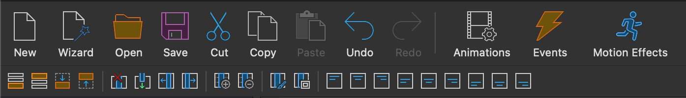
The Layout Grid tools are also available via the Format menu.
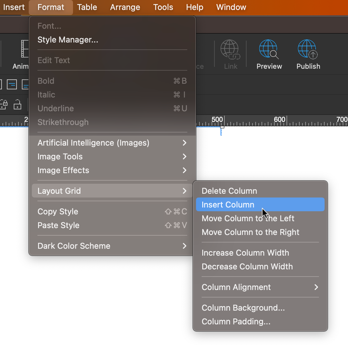
Column Properties
Set the background, alignment, and padding of the selected Layout Grid column directly from the Ribbon or menu.
This eliminates the need to first open the Layout Grid properties, select the column, and then click "Style".
Set the background, alignment, and padding of the selected Layout Grid column directly from the Ribbon or menu.
This eliminates the need to first open the Layout Grid properties, select the column, and then click "Style".
Delete Column
Quickly remove the selected Layout Grid column (including the content).
Insert Column
Quickly insert a new Layout Grid column.
Move Left / Move Right
Quickly change the order of Layout Grid columns (including the content).
Increase / Decrease
Quickly change the size of the selected column.
Quickly remove the selected Layout Grid column (including the content).
Insert Column
Quickly insert a new Layout Grid column.
Move Left / Move Right
Quickly change the order of Layout Grid columns (including the content).
Increase / Decrease
Quickly change the size of the selected column.
