Create a responsive website with floating layers
The Layer object in Quick 'n Easy Web Builder is a very powerful feature for advanced web layouts and i can be used for many different layout types. In this tutorial we will explain a new concept called floating layers. This can be used to create 'responsive' layouts. Responsive means that the layout will adapt itself automatically based on the available screen size. For example on mobile devices with different screen sizes.
The Floating Layer mode of a Layer will make the layer 'float' instead of having a fixed position. If multiple floating layers are placed on the page then they will be placed next to each other (from left to right) depending on the available screen space. If the layer does not fit on the current row then it will be wrapped to the next row.
The property Floating mode can be used to control the 'float behavior':
• Default
The layer will be positioned to the right side of the previous floating object. If the object does not fit on the current row the it will move to the next row.
• Clear Left
The layer will be forced to the next row (even if there is still space on the current row). The layer can have other objects on the right side of the row (unless the next floating object is also set to clear left).
• Full Width
The layer will use the full width (100%) of the page. No other objects can be on the same row. This mode can be useful for headers or footers.
Note: Floating layers can be part of another (floating) layer. However currently only one nesting level is supported.
Here is an example how this feature can be used:
Step 1
Insert a Layer. This will be the header of the page.
Set the width to exactly 320 pixels (the height does not matter). We use 320 pixels because that is the minimal resolution we want to support.
Step 2
Set the Layer mode to 'Floating Layer' and select 'Full Width' for the Floating mode.
Also set the alignment to 'Center' this will align all content in the center of the layer.
Click OK and note that the Layer is now moved upper left corner of the page!
All other floating objects will be positioned after this object and because we have set the layer to Full width, no other objects will be in the same row. When you preview or publish the page the layer will expand to the full size of the page automatically.
Step 3
Next we will add some content blocks. In this example we use a few layer with image and some text.
a) Insert a new Layer
b) Set the width to 140 pixels and the height to 160 pixels.
c) Set the Layer mode to 'Floating Layer' and set all margins to 10.


We now have a layer with a total width of 140 + 2 x 10 (margin) = 160 pixels.
This means that if we add another layer with the same width then we can have 2 layers on one row.
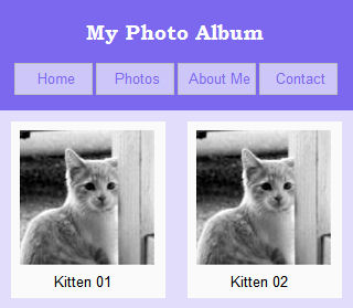
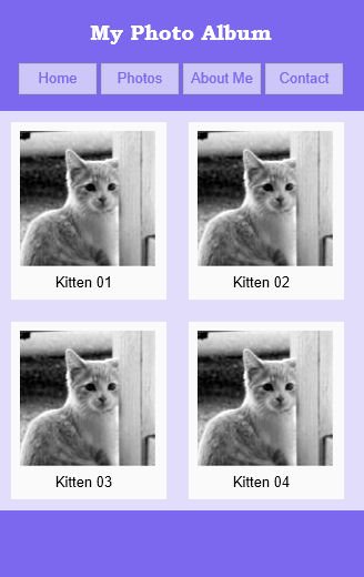
This is how it will look on a screen with a width of 320 pixels:

Step 4:
In the last step we will also add a footer:
a) Insert a Layer. Set the width to exactly 320 pixels (the height does not matter).
b) Set the Layer mode to 'Floating Layer' and select 'Full Width' for the Floating mode. Use 'Center' for the alignment.
In the last step we will also add a footer:
a) Insert a Layer. Set the width to exactly 320 pixels (the height does not matter).
b) Set the Layer mode to 'Floating Layer' and select 'Full Width' for the Floating mode. Use 'Center' for the alignment.
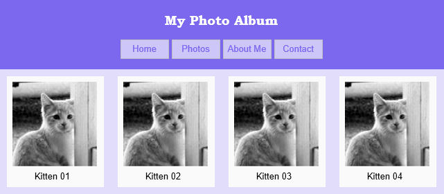
If we add more layers then it may look like something this (on a larger screen)


You can see a live example here:
http://www.quickandeasywebbuilder.com/support/floatinglayer/
Download the demo project:
http://www.quickandeasywebbuilder.com/support/floatinglayer/floatinglayer.zip
http://www.quickandeasywebbuilder.com/support/floatinglayer/
Download the demo project:
http://www.quickandeasywebbuilder.com/support/floatinglayer/floatinglayer.zip

